Saturday, September 14, 2019

Capturing Movement - Step by step tutorial

This is the original image . ((Thanks for the amazing shot! Photo credit - https://www.facebook.com/shankar.dipak ) .)


Always remember what attracted you to this image initially. Your job is to bring out that element in whatever you do with the image, using whatever style you use - line drawing, water color, acrylic, digital whatever.


If you observe this photo has captured the movement where the animals are running diagonally towards the camera. It is NOT a side view, since we can see the chest part of both the animals.
The red lines capture the EXPLOSIVE ENERGY WHICH ATTRACTED ME TO THE IMAGE WHEN I SAW IT. THIS IS WHAT I HAVE TO CAPTURE . THE REST ARE MERE DETAILS.


These lines are the ENERGY LINES which connect both these animals in a poetic fashion. SO I SHOULD NOT LOSE THESE ENERGY LINES IN MY SKETCH.


These are the PROPORTIONS. I took the length of the antelope's body as the basic measurement scale. I measured all the elements using that base length.


Now I measured the VERTICAL proportions using the same base length.


Now I have full clarity on the proportions, scale . So whatever is the size of my paper, If I fix the centre point I can draw the outline of both animals in the centre of my paper.


Here is the defined outlines using a thin pen


Once the outline is defined I try to bring out the VOLUME of each part, since that round shape of legs, heads and bodies will make the animals SOLID.


Now I am fixing the VALUES OF LIGHT on the animals' bodies. Some parts are dark, some capture the light. I study which are the DARKEST DARK and LIGHTEST LIGHT . Throughout the process after this, I have to MAINTAIN THESE VALUES OF LIGHT.


Now, I work on the details like the Cheetah's spots, the eyes , the colouring


This is the last process, where I used a thicker PEN BRUSH to increase the CONTRAST  and HIGHLIGHT whatever I want to dominate.
.....................................................
S.SreeRam
NATHAN'S MEDIA GROUP
Mobile: 0 9380000555
Email: nathansmedia@gmail.com

Saturday, September 7, 2019

The Invisible Energy Lines!

This is a sketch of Luciano Pavarotti, Italian operatic tenor!My  interpretation for this week Caricaturama.  - in which artists from all over the world contest by drawing one celebrity, every week. If you are a budding cartoonist this is a FB page to visit.

I used PEN AND PEN-BRUSH 
The whole sketch is held together by some invisible lines - which i call ENERGY LINES!
Even though the viewer will not see the lines , he will feel it .. He will feel the coherence that make the sketch working together as a whole.


I draw these ENERGY LINES in the rough pencil sketch. After I draw the pen lines I erase the pencil lines. Those lines will be something like this 


........................................................................
KravMaga SreeRam, Chennai. 9380000555


Monday, September 2, 2019

Giving life to a sketch! Is it ART or SCIENCE!?

This post is for budding artists to whom I wish to demonstrate in a few simple STEPS that "Bringing life to a sketch is NOT only just ART but also a SCIENCE"  

STEP 1 - The Foundation
Sometimes when we look at a scene or a photo, we think, " Hmmm...This will be interesting to sketch." But when we sit down with a pencil, we will keep staring at the paper wondering where to make the start.

TIPS-
  • If the face is straight like a passport photo the sketch will be boringly stiff. If the face is tilted and the look is elsewhere, the picture will be dynamically natural.
  • Decide how much space the picture will occupy on the paper. Based on that, if you fix your approximate measurements, it will be simple.

Since the subject in this sketch is extreme close-up, I took my base measurement scale as the forehead height, hairline to middle of eye-brows.
Some artists prefer to draw a grid of squares and base measurements on that grid. But. learning to visually judge measurements holding the pencil is a good practice.
Courtesy - http://www.beginnersschool.com/2015/05/04/measuring/
STAGE 2 - CONSTRUCTION
Once the measurements are fixed, you can start sketching the outer-lines of each element. DON'T FOCUS ON BEING 'PERFECT' at this stage. Now your objective is to understand the important elements of the final image.
After sketching the outlines, mark the DARK AREAS of the image.


The objective of marking the DARK AREAS is to add dimension to the flat pencil sketch. The sketch now acquires a 3D feel, which will increase your energy and confidence.

TIPS - 2 Artistic Devices 
1. ANGLE OF LINES 
If you observe the lines defining the dark areas, you will notice that they run in the same direction as the slope of the raised areas. This enables us to feel the VOLUME of the parts we draw. The sketch also becomes alive by rising from the surface of the paper.
2. ENERGY LINES 
The other subtle and mature artistic device are what I call the ENERGY LINES.  These lines help us to understand the flow which connects the various elements and make the whole image function as one unit.
You can draw these lines to understand the flow and later erase them before or after finishing the sketch.

When we look at the ENERGY LINES separately we can appreciate the lyrical life of the image. Here they are. Have a look!
These ENERGY LINES are like the basic musical Raga which underlies all the elements of a song.

STAGE 3 - POLISH & FINISHING 
Now we have all the elements in our control. It is time to drop the pencil and pickup the pen or brush to apply confidently.


STAGE 4 - GIVING CHARACTER
Define the dark areas and bring them out in full contrast. If you hesitate at this stage the image will fall flat and become insipid. The CONTRAST is a major catalyst in giving an unique CHARACTER to the image.


You can wrap up and close the sketching at this stage. Or you can continue to add a few flourishes if there is a specific need or if  your are in a mood to experiment.


Governor Dr Tamilisai Soundararajan ! Pen & Pen-Brush. by KravMaga SreeRam
........................................
NATHAN'S MEDIA GROUP
Mobile: 0 9380000555
Email: nathansmedia@gmail.com
MARCOM BLOG -  http://marketing-communications-ksr.blogspot.com/
FACEBOOK - http://bit.ly/nmg_fb
LINKED IN -  http://in.linkedin.com/in/ksr960
TWEET - @kravMagaSreeRam

Friday, August 30, 2019

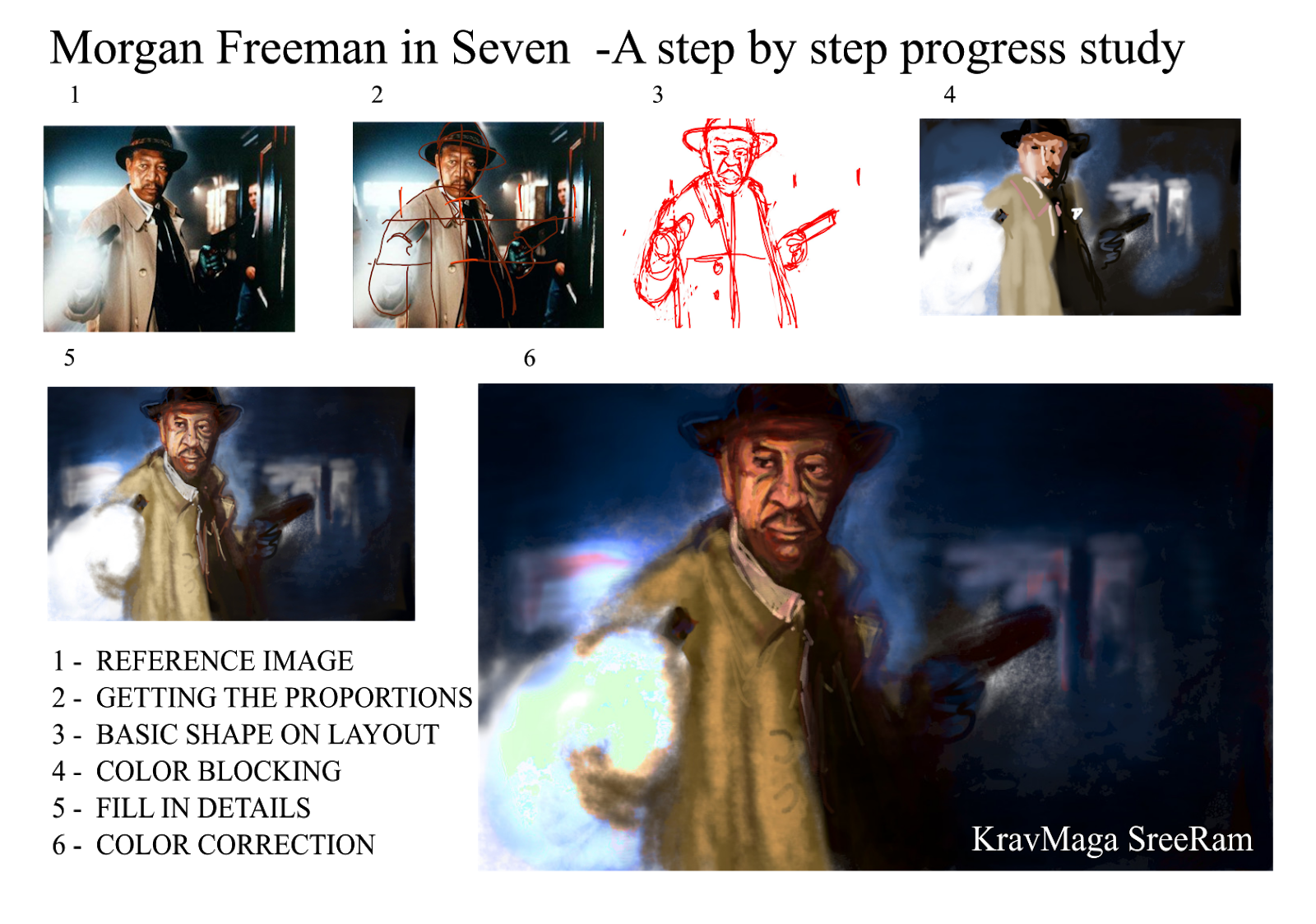
The metamorphosis of creating!

I prefer to draw manually, but drew this on a freeware GIMP so that I can explain the progress, to some friends who specifically asked me to explain the progress.
1.. is the reference image.
2. GETTING THE PROPORTIONS
When we work on computers, the easy way out is to trace the image, But there is NO learning in that. To teach myself to observe the proportions, I took Morgan's face length as the base measurement scale. So his shape in this photo was roughly 3 faces height and approx 2 faces width.

3. BASIC SHAPE ON LAYOUT
Now that I had the measurement references, i fixed the centre line of Morgan, approximatly cutting him vertically down from the centre of his eyebrows and along his jacket's edge /lapel.
Once these parameters are defined, it is reasonably easy to draw Morgan's outline on the overall layout.

4. COLOR BLOCKING 
In another layer, I started fixing the color hue (color) and values (light to dark). At this stage I am not getting into the details, as my intention is to get the image's unique character in place. I know if i get this stage right, it is only a small step forward to ...

5. FILL IN THE DETAILS
This is more or less the last mile of completion. One can leave with this version or add some drama with....
6. COLOR CORRECTION
add some personal flavour in the color, make the tones richer, remove some unwanted details.
This is more or less the thinking and execution process when working on an opaque medium like oil, acrylic or crayons..
While using water colors we have to be more deliberate while blocking the colours, since no camouflage is possible
..........................................
SreeRam
0 9380000555

Thursday, August 22, 2019

Manaseega Gurus - 01 - John Constable

In 18th century England, landscape painters were not respected. Biblical, mythological themes or portraits only were considered art. John Constable coming from rural Suffolk did not care much for the critics and painted the scenes around Dedham Vale, which even now is called 'Constable Country'.
While his own England did not recognize him, Constable became a rage in France where his 'The Hay wain" won the Gold at 1824 Paris Salon.

He was way ahead of his time with his Plein air oils, which captured the drama of sunlight on clouds, water and sprawling fields. In fact, John Constable was an inspiration to the later Impressionists.
John Constable's paintings consciously avoided the signs of the booming industrialization. Thats why he is the quintessential painter of idyllic rural England.


................................................................
SreeRam 9380000555

Thursday, November 23, 2017

Composition - Decisions to make before you start painting

Composing a frame 
One of the WOW factor is how the artist has composed the art, whether it is a painting, movie scene or a photograph.
Positioning the main subject in the centre of the canvass is common, but it is so boring like a passport photo.
So, before starting to sketch, while the artist is looking at the reference, he is doing some mental cropping. He is making quick decisions on which elements to highlight, which ones to sacrifice so that the main subject is the protagonist. The artist is also trying to make the composition aesthetic.
Reference shot in my mobile
For instance, this was the reference I shot for painting "The Narcissist". If I had drawn the same. the viewer would have seen the scooter as the main subject since the bird is insignificant. 
But the whole drama was in the bird looking at the mirror! So, I zoomed in; but not too much.
There were those interesting reflections on the polished surface of the helmet. Also, the angle of the handlebar was dynamic and taking the eye towards the main subject - The Narcissist


Wednesday, December 3, 2014

Bangalore BHEL guest house - Light & Perspective

Light & Perspective study by KravMaga SreeRam
I was in Bangalore yesterday and staying at the BHEL guesthouse. Suddenly i realised the room had some interesting light and lines. 
Perspectives of the bed, table and sofa were in contrast to the horizontal perspective lines of the floor and door ways.
The external light on the floor was also bouncing of the walls give a glow on the walls and curtains. 
Note the bouncing lights and the different hues of shadows
....................................
Artist - KravMaga SreeRam
Acrylic on paper board
Size without border -13 x 26cm
Ref. No. 23
...................................................
Ph;  0-934 000 66 00
Please don't reproduce in any medium, in any form without formal permission of the painter.